Attention: Business Owners!

90% business logos we analyse Show growth-blocking patterns.

Is yours one of them?

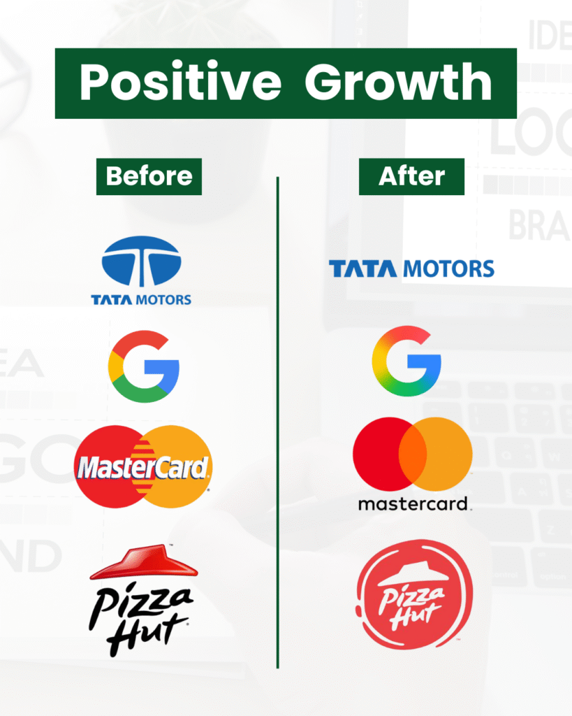
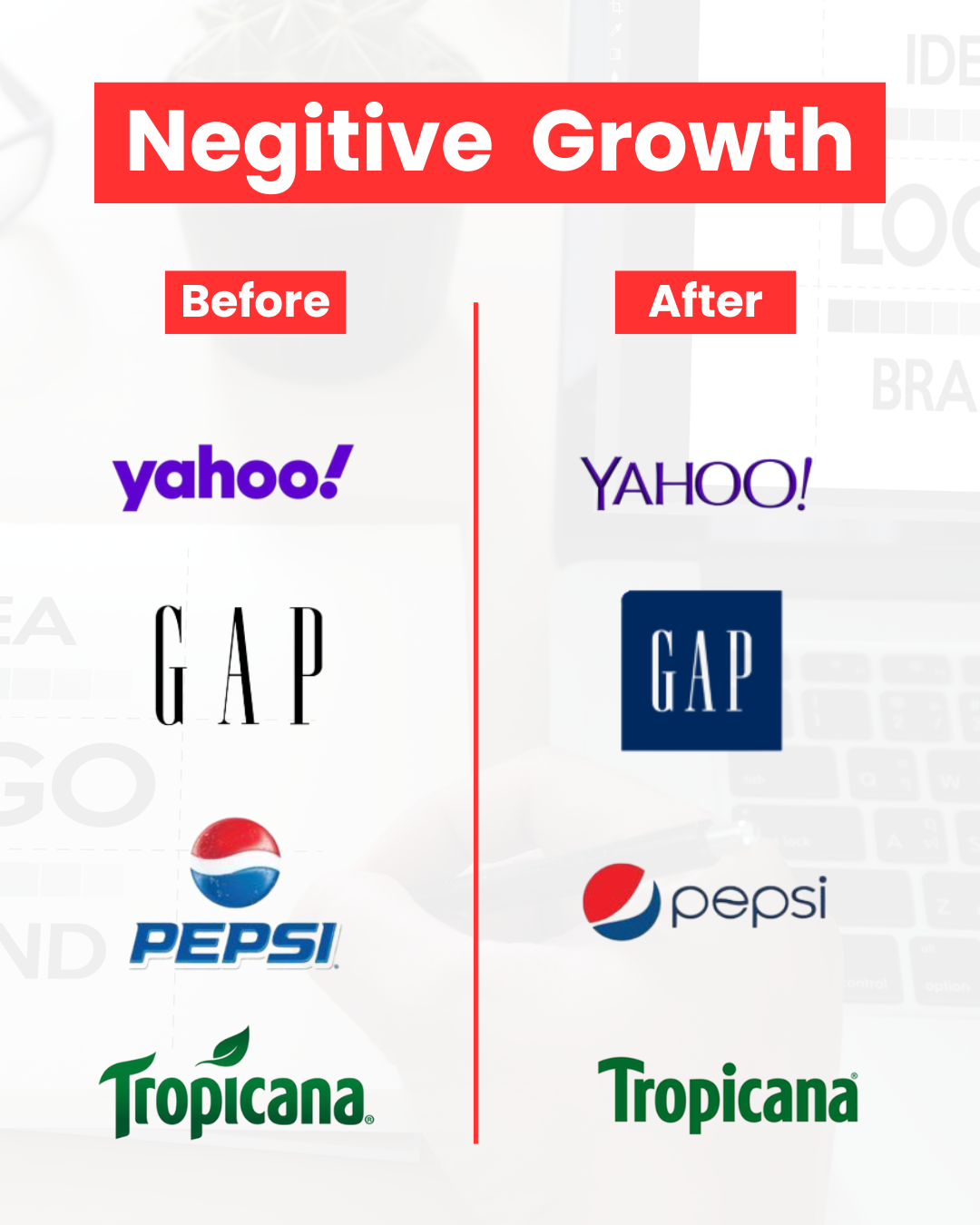
Check how your logo is impacting your business.

Check how your logo is

silently impacting your business.
It’s not just a design — it’s a vibration.
And if that vibration is off…
You’ll feel it in your sales, your team, your growth, and your peace of mind.
No matter how hard you work, how smart your strategy is, or how much you invest 
If your logo is sending the wrong signal, everything stays stuck.

Your Logo Could Be the Root of These Problems:

😣

Low Sales

😩

No Repeat
Customers/Clients

💔

Slow Business Growth
& Poor Cashflow

🚀

Marketing Not
Delivering Results

If any of these sound familiar, it’s time to scan what you’ve been ignoring:

This Is Your Sample Report Below

See what a real Scientific Logo Analysis looks like, and how it uncovers the hidden reasons behind business blocks.

When a Logo Works For You or Against You

Big Companies That Transformed After Changing Their Logos

Why Even Google Changed Its Logo

Because Success Needs Alignment Not Just Innovation

Google

Scientific Logo Analysis – Google Logo (Before)

Disconnected Energy:

No Internal Integration Google’s products are Designed in silos – Gmail, Drive, YouTube, Maps, Calendar – all operate independently.

There’s: No deep energetic or visual linkage between them. The colors are not blended, which reinforces a lack of synergy. This design reflects a business model that offers many tools but lacks cross-product cohesion from the user’s subconscious perception.

Google

Scientific Logo Analysis – Google Logo (After)

Connected Energy: Internal Integration with AI

Unlike past versions, this logo shows blended transitions between red, yellow, green, and blue.

There’s:

Mastercard: Before vs After the Logo Change

The Real Shift? Logo Vibration = Brand Expansion

Scientific Logo Analysis – Before the Logo Change (Pre-2016)

  • Logo had overlapping red and yellow circles with bold text across the center.

  • Visual felt cluttered and outdated for a digital-first world.

  • Brand identity tied heavily to physical credit cards.

  • Perception: old-school, transactional, limited flexibility.

  • Energetically, the overlap of elements created identity confusion — signaling friction, not flow.

Scientific Logo Analysis – After the Logo Change (Post-2016 Refresh & 2019 Wordless Version)

  • Simplified two-circle symbol: clean, minimal, iconic.

  • Dropped the name from the logo — bold move showing confidence and brand maturity.

  • Shifted identity from a “credit card company” to a tech-driven global payment ecosystem.

  • Energetically, the new logo vibrates with clarity, trust, and universal access.

  • Increased trust, stronger digital presence, and better resonance with Gen Z and fintech audiences.

Tata Motors: Before vs After the Logo Change

Scientific Logo Analysis – Before the Logo Change

  • Outdated design symbolizing the past.

  • Brand perception: traditional, reliable, but not innovative.

  • Sales growth was steady but lacked spark.

  • Limited emotional resonance with the younger generation.

  • Global expansion was slow, brand energy felt “stuck.”

Scientific Logo Analysis – After the Logo Change

  • Sleek, modern logo aligned with innovation and motion.
  • Shifted from “just reliable” to “future-ready and bold.”
  • Surge in interest for Tata’s EV segment (Nexon EV, Tiago EV).
  • Brand appeal strengthened among tech-savvy youth.
  • Global growth accelerated with increased exports and partnerships.
  • Vibration of the logo aligned with progress, movement, and scale